OK, SMILE
A Concept | Brand Identity, Illustration, Packaging, Print
OK, Smile makes innovative skincare for individuals that want all of the bite, but none of the bark. OK, Smile was started to fill the void between clean and potent products and young adults—offering conscious skincare for the conscious generation.
WHIMSY MEET SERIOUS, SERIOUS MEET WHIMSY
OK, Smile needed a design system that reflected the juxtaposition between their unbridled joy and the clean image associated with "serious" skincare.
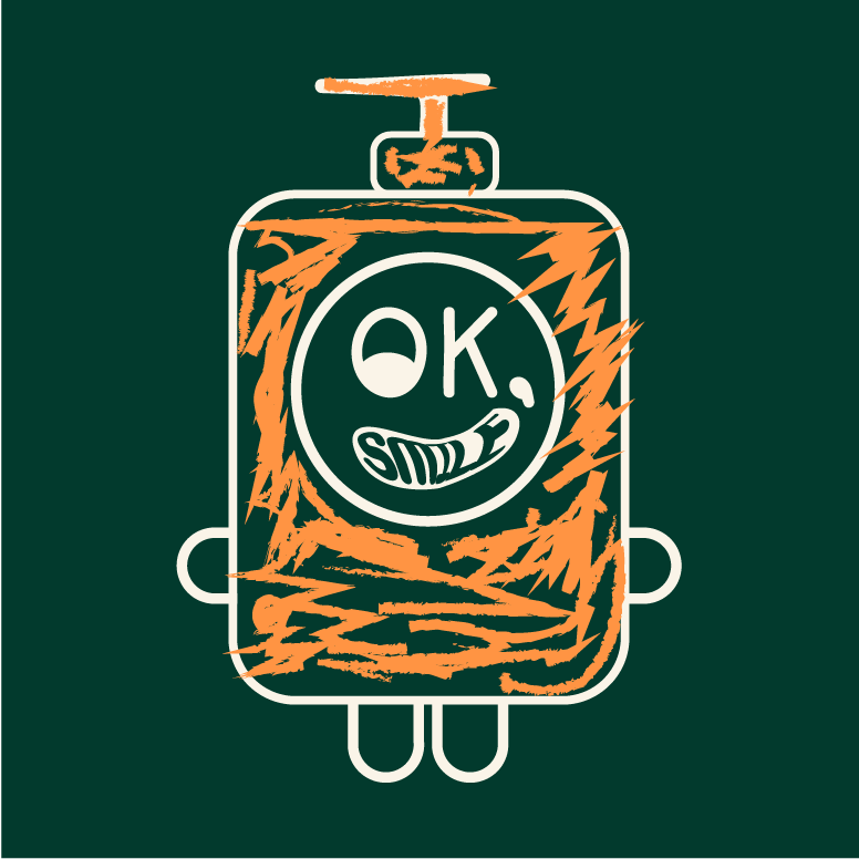
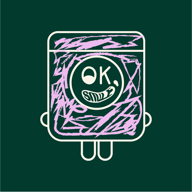
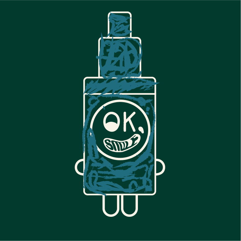
I took inspiration from a box of crayons and naïve art. I contrasted the youthful vibes with the cleanliness of the green and cream throughline.
The illustration serves as a mascot and a break from the type heavy packaging. In addition to the hand lettered logo, the illustration serves as both a bit of whimsy and humanity.
PALETTE AND TYPE
Bagatela is the main workhorse typeface. Shown in Light Italic, the type demonstrates its unserious seriousness
A bold and saturated color per product provides a flexible color palette.


